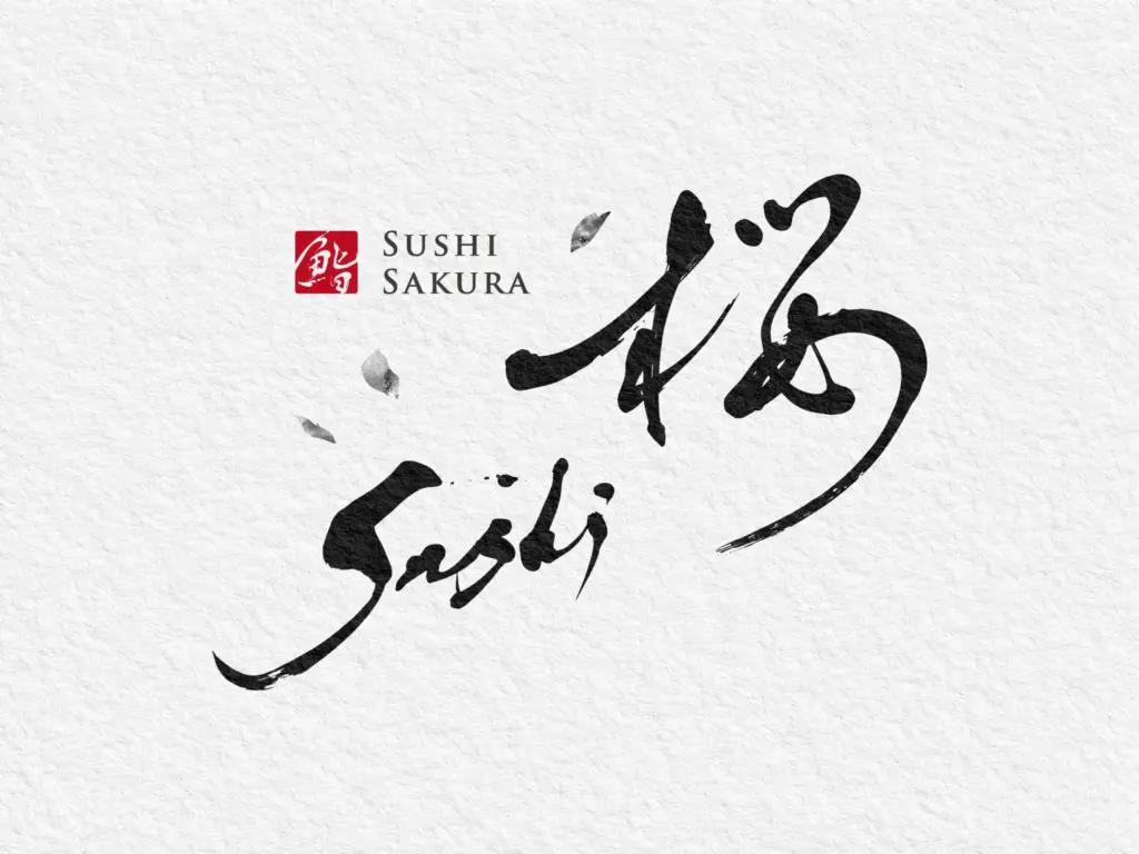
【筆文字ロゴ制作事例 】
|文字| SUSHI SAKURA 桜
|カテゴリー| 筆文字、筆文字ロゴ、鮨店
鮨店 SUSHI SAKURA 桜は、江戸前の精緻さと“おもてなし”のやわらぎを表現した筆文字ロゴです。流れるような運筆で描いた「桜」は、花弁が舞い上がる瞬間の躍動と、寿司職人の所作の“間”を同時に表現。にじみ・かすれ・止め・はねのリズムが、旬の移ろいと一貫の余白を匂い立たせます。右上へ弧を描く終筆は、縁起の良い“上がり”を象徴。角印の朱は店印=確かな技を示し、英字のSushi Sakuraは英語表記とし、外国の方でも分かりやすいように意図しました。
季節がめぐるたびに新しい表情を見せる—そんな店の理念を、墨の濃淡と和紙の地肌に刻んだ、「味が咲く」アイデンティティです。
—
Sushi restaurant SUSHI SAKURA features a brush-lettered logo that conveys Edo-style precision and the gentle spirit of omotenashi. The flowing strokes of “桜 (Sakura)” capture both the lively moment when petals lift into the air and the poised interval—ma—in a sushi chef’s movements. The rhythm of ink bleed, dry brush, stops, and flicks evokes changing seasons and the expressive negative space around each piece of sushi. The ascending terminal stroke curving to the upper right symbolizes an auspicious “upturn.” The vermilion square seal functions as a shop mark, signifying assured craftsmanship, while the Latin rendering “Sushi Sakura” is included for clarity to international guests.
Etched in shades of sumi ink and the texture of washi, this is an identity where flavor blooms, embodying the restaurant’s ethos of revealing a new expression with every season.